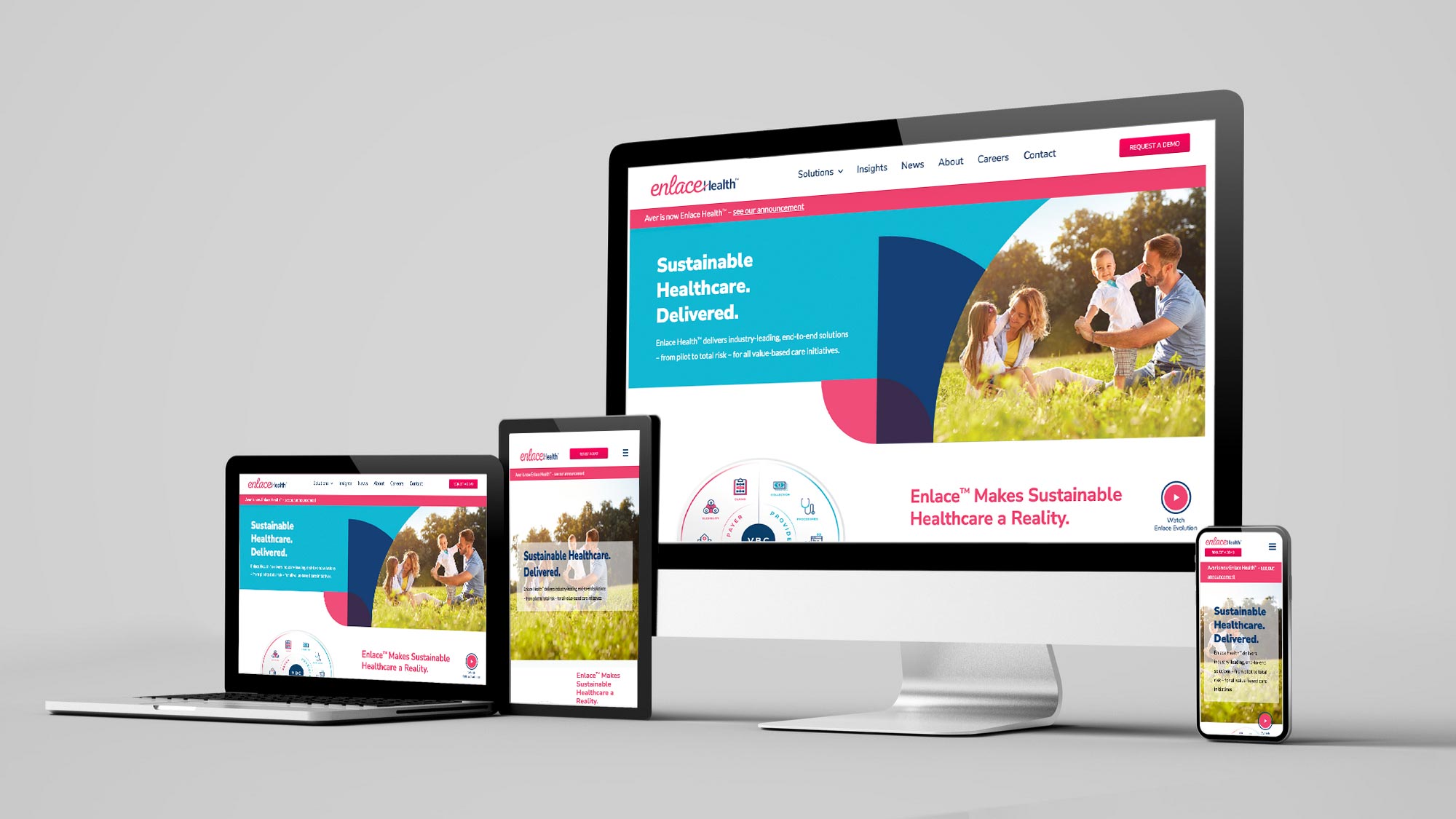
Modern UI design goes beyond aesthetics. It's about creating interfaces that are intuitive, accessible, and delightful to use. Here we break down the principles that separate good products from great ones—and how to apply them in your own work.
Clarity beats cleverness. Users should understand what they can do and where they are at a glance. Use clear labels, consistent iconography, and a visual hierarchy that guides the eye. Avoid jargon in the interface and hide advanced options until they're needed.
Consistency builds trust. Reuse the same patterns for navigation, buttons, forms, and feedback across your product. A design system—even a lightweight one—keeps spacing, typography, and colors predictable so users don't have to relearn your app on every screen.
Feedback is non-negotiable. Every action should have a visible result: loading states, success messages, errors, and hover or focus states. When users tap, type, or submit, they need to know the system received it and what happened next.
Accessibility is part of the job. Semantic HTML, sufficient color contrast, keyboard navigation, and screen reader support aren't optional for inclusive design. Start with accessible markup and patterns; it's easier than retrofitting later.
Key Takeaways
- Prioritize clarity and hierarchy so users know what to do and where they are.
- Keep patterns consistent so the product feels coherent and trustworthy.
- Give clear feedback for every action so users never wonder if something worked.
- Build accessibility in from the start with semantic HTML and keyboard support.


